What's the most deployed geospatial server software?
Posted on 2020-06-04One of the things we've been meaning to do for a long time is investigate which geospatial server software is most prevalent for serving up all these services GeoSeer has in its index. After all, what's the point of having the world's largest index of geospatial web services at your fingertips (shameless plug!) if you're not going to use it to answer interesting questions?
The answer is...
... not 42, that's a different question. The one word answer is: ArcGIS. But as ever with these things, there's a much more nuanced story to tell. For example, the software that hosts the most datasets is easily GeoServer. The question we're answering is: What's the most deployed software out there for serving up publicly accessible geospatial data via WMS, WFS, WCS, and WMTS services? While that may read like a lot of caveats, this isn't a tabloid newspaper! Here are the results in one big table.
Note: Deployment = At least one instance of this software, grouped by domain (i.e. geoserver.example.com, and geoserver2.example.com are two deployments); Service = A single service, the thing you get when you copy/paste a WMS/WFS/WCS/WMTS URL into your GIS.
| Software | # Deployments | # Services | # Datasets |
|---|---|---|---|
| ArcGIS Server | 2,755 | 72,054 | 517,169 |
| Cardogis | 13 | 714 | 2,869 |
| Cubeserv | 7 | 36 | 1,141 |
| deegree | 45 | 3,043 | 15,062 |
| Erdas | 16 | 52 | 797 |
| Ewmapa | 17 | 17 | 189 |
| Extensis | 2 | 2 | 123 |
| Geognosis | 6 | 11 | 256 |
| Geomedia | 26 | 533 | 11,078 |
| GeoServer | 964 | 22,673 | 963,603 |
| GeoWebCache | 49 | 98 | 42,128 |
| MapBender | 4 | 30,997 | 31,060 |
| MapCache | 14 | 23 | 7,495 |
| MapGuide | 4 | 5 | 258 |
| MapProxy | 15 | 65 | 610 |
| MapServer | 544 | 57,606 | 389,709 |
| QGIS Server | 60 | 613 | 11,924 |
| Tekla | 22 | 22 | 461 |
| THREDDS | 43 | 26,976 | 51,345 |
| UNSURE | 17 | 439 | 1,395 |
| UNKNOWN | 507 | 12,470 | 178,995 |
UNSURE means it could be one of several things. UNKNOWN means no idea at all. Linked software is Open Source.
The proprietary world
The first thing that jumps out is that ArcGIS has a huge number of deployments at 2,733, that's 53.7% of them. In reality, there are actually a lot more ArcGIS servers out there (at least ~4,900 in our index), but here we're only counting the ones that are serving WMS/WFS/WMTS/WCS. The rest are likely only serving via ESRI standards.
The next obvious thing in regards to proprietary is that outside of ArcGIS, the rest of them aren't even "also rans", totalling just 2.12% of the deployments and are behind only 0.75% of the datasets served. Barely a rounding error! It's likely there are a few more different pieces of proprietary software in the UNKNOWN grouping, but probably not enough to make a real difference.
The power of Open Source
Open Source has a much healthier ecosystem, with MapServer and GeoServer having very large deployment counts, and niche servers like THREDDS (oceanic data community), and GeoWebCache (caching server) also serving up alot of data.
If you group the proprietary/open source servers together, things become even more interesting:
| Software Type | # Deployments | # Services | # Datasets |
|---|---|---|---|
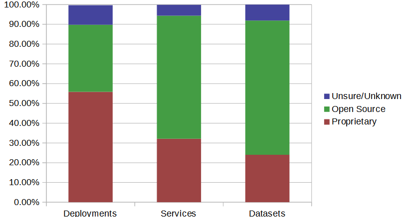
| Proprietary | 2,864 (55.83%) | 73,441 (32.15%) | 534,083 (23.97%) |
| OpenSource | 1,742 (33.96%) | 142,099 (62.2%) | 1,513,194 (67.93%) |
| UNSURE/ UNKNOWN | 507 (9.88%) | 12,470 (5.46%) | 178,995 (8.04%) |
 Graph version of the above table.
Looking at the above it rapidly becomes clear that while there may be a lot of ArcGIS deployments, they're not sharing much data as compared to the Open Source installs. It seems reasonable to conclude that ESRI are very good at selling their software to cities/counties/local provinces, who then use it to comply with "Open Data" edicts, but when it comes time to roll out an SDI, Open Source is where it's at. In fact, Open Source solutions are behind at least two thirds of the world's OGC served datasets!
Deployment patterns
One final data table. This one breaking down some of the software a bit further, this time including the average number of services per deployment, and datasets per deployment.
| Software Type | # Deployments | # Services | Avg Services/ Deployment | # Datasets | Avg Datasets/ Deployment |
|---|---|---|---|---|---|
| Popular Data Servers | |||||
| ArcGIS | 2,755 (53.7%) | 72,054 (31.54%) | 26.15 | 517,169 (23.22%) | 187.72 |
| GeoServer | 964 (18.79%) | 22,673 (9.92%) | 23.52 | 963,603 (43.26%) | 999.59 |
| MapServer | 544 (10.6%) | 57,606 (25.22%) | 105.89 | 389,709 (17.49%) | 716.38 |
| THREDDS | 43 (0.84%) | 26,976 (11.81%) | 627.35 | 51,345 (2.3%) | 1194.07 |
| Totals (All) | 5,130 | 228,449 | 44.53 | 2,227,667 | 434.24 |
This further reinforces the point that ArcGIS deployments don't have many datasets on them as compared to the Open Source variants. It also shows how different servers structure themselves; MapServer has a lot of services per deployment, and THREDDS has a huge number. THREDDS then carries this over to a very high number of datasets per deployment as well, explaining why with such a low number of deployments it still serves more datasets than all of the non-ArcGIS proprietary systems combined.
How it was done
That's the end of the stats, but for those interested in how it was done, read on. (It's like a bonus blog post!)Fingerprinting
The short version is that most servers return unique components in their responses (which are XML documents) that allow us to fingerprint them. For example: A unique XML namespace for example; a comment that explicitly says what it is: <!-- MapServer version ... --> (hmm, what could that be?); a certain combination of supported formats; and even the path component of the URL to the service: https://psl.noaa.gov/thredds/wms/Datasets/NARR/Monthlies/monolevel/wspd.10m.mon.mean.nc.
We can also rely on lazy administrators who have left defaults in place. For example default service titles ("MapGuide WMS Server") and abstracts, or a ridiculously long, 5000+ item list of default projections that the server supports that 1 in 6 GeoServer administrators hasn't culled.
False Negatives over False Positives
Using these various fingerprints we can then assign a server-score to the response depending on which factors it meets. We leant towards false negatives, meaning if we weren't sure it was unique, we wouldn't use it as a fingerprint. This is evidenced by the low number of "UNSURE" results, the majority of which are some flavour of MapBender impersonating deegree.
Limitations
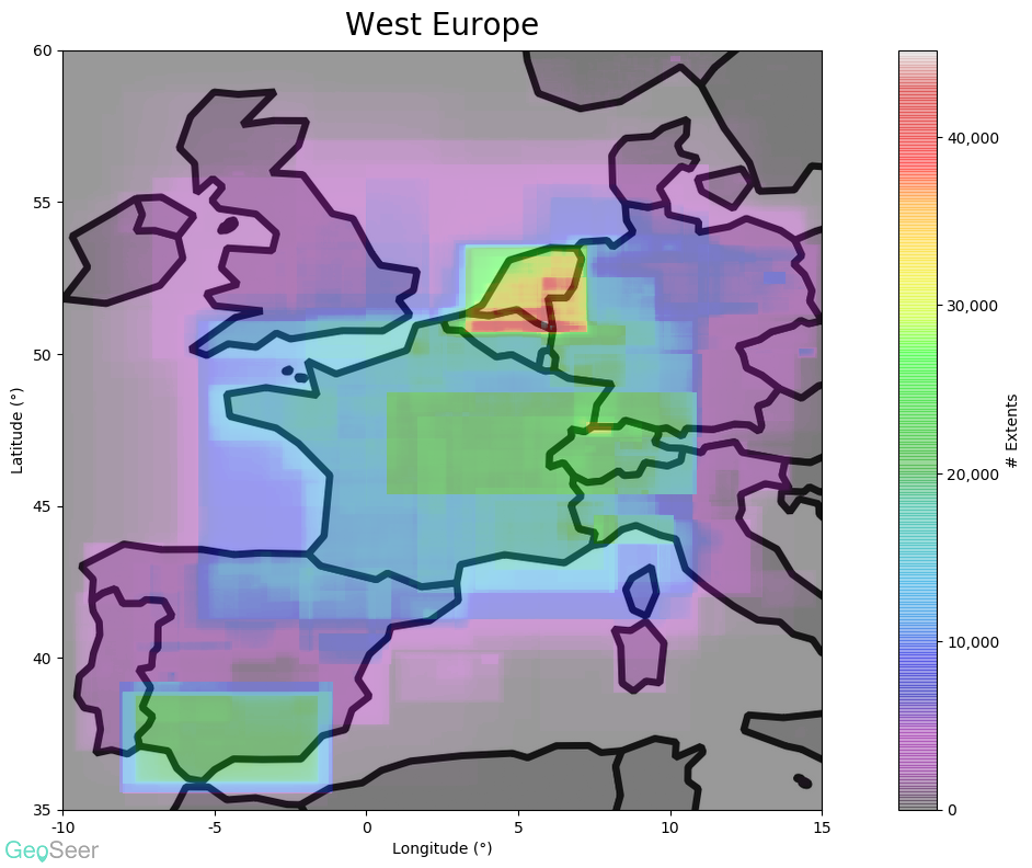
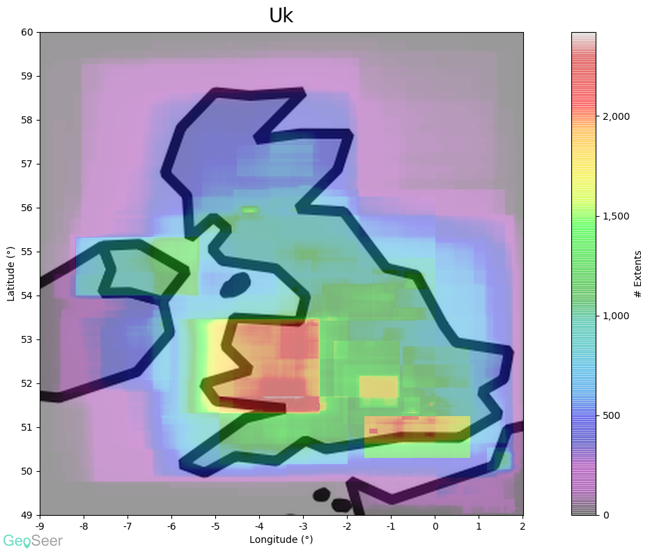
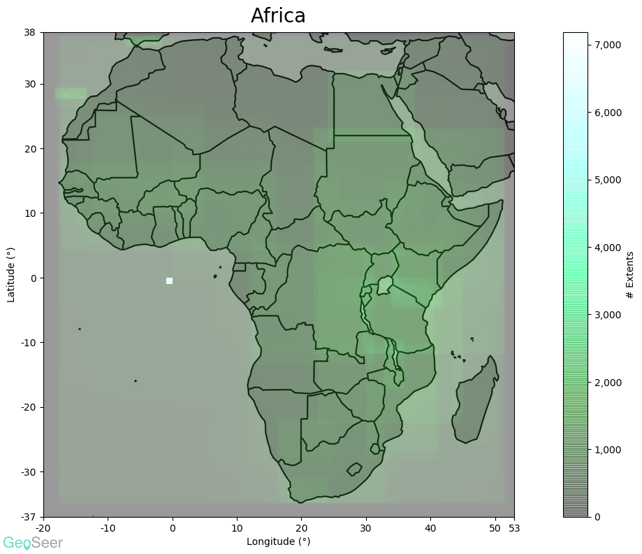
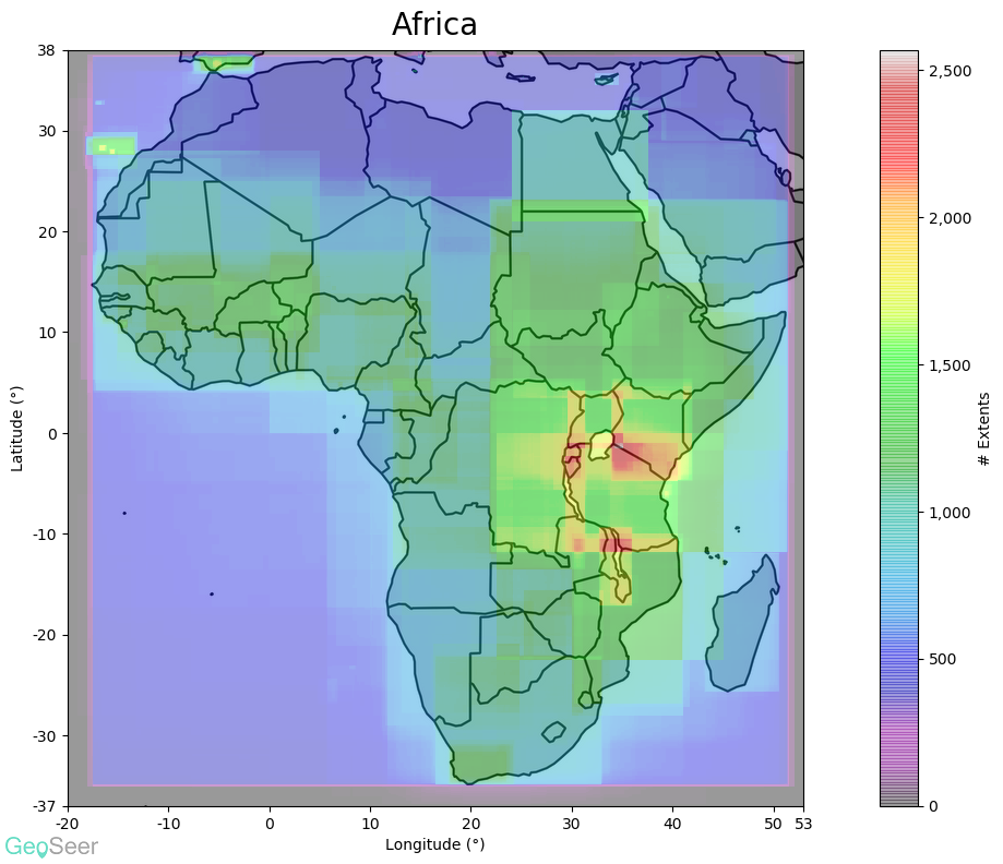
It's important with this sort of thing to point out the limitations of the methodology, and the caveats it comes with, like we do with the extents plots.
Fingerprinting does have its limits, for example GeoWebCache is integrated into GeoServer, so stand-alone GeoWebCaches may be under-counted. Similarly the proxy servers (MapProxy, GeoWebCache, and MapCache), by definition are only caches for actual renderers sitting behind them. That rendering software could be anything. As such the numbers for the caches should certainly be treated with a grain of salt; it may be underestimated because they're often invisible. This also means when they're not invisible we have no way of knowing what's behind them.
Confidence Levels
Some pieces of software we're very confident we've managed to identify all of the deployments in our index because they have clear fingerprints that server administrators are extremely unlikely to change (custom namespaces, obnoxious hard-coded software-licensing details, etc). The below table shows how confident we are that we found all of that software within our index. High confidence means we're pretty sure we found it all, low confidence means there could be more deployments in the "UNKNOWN" and/or "UNSURE" groups.
| Software | Confidence |
|---|---|
| ArcGIS Server | High |
| Cardogis | High |
| Cubeserv | High |
| deegree | Low |
| Erdas | High |
| Ewmapa | Low |
| Extensis | Low |
| Geognosis | High |
| Geomedia | High |
| GeoServer | Medium |
| GeoWebCache | Low |
| MapBender | Low |
| MapCache | Low |
| MapGuide | Low |
| MapProxy | Low |
| MapServer | High |
| QGIS Server | High |
| Tekla | Medium |
| THREDDS | Medium |
General Notes and Caveats
- There can be many software installations behind one "deployment".
- Some domains have multiple different pieces of software behind them; this is why the number of deployments is higher than the number of "hosts" on the stats page.
- Results based on a snapshot of global geospatial services for mid May 2020
- Excludes servers that only have "meaningless" data/services, and demo/test servers. Only includes servers that actually serve data.
- The GeoSeer index, while the largest we know of, doesn't cover all public services. But there's certainly enough that this should be an accurate representation.
- This only covers public facing, freely accessible services (i.e. the sort GeoSeer Indexes). There will be many more deployments of all of this software that only points at internal corporate networks.
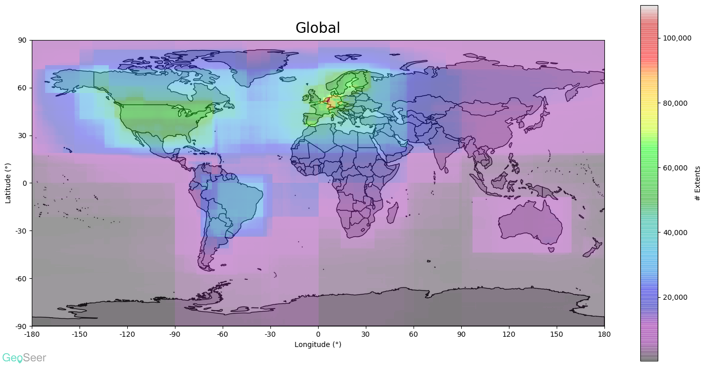 Starting with the global plot (above) it's obvious that the EU's INSPIRE directive has had a considerable effect, particularly in central Europe. The USA and Brazil also have considerable coverage.