The GeoSeer Blog

Plotting Dataset Extents

Posted on 2019-10-31

Back at the start of September we released some historical statistics and, almost as an afterthought, mentioned the new extents plots. In this post we explore those dataset extents plots in more detail.

Extent Plots; What Are They?

Put simply, every dataset that GeoSeer indexes follows various standards which say that the datasets should declare a rectangular bounding box which represents its spatial extent, i.e., where does the dataset cover? So if it's a dataset covering Germany, it should declare a box covering Germany, but because Germany isn't a rectangle, the box will overlap with surrounding countries to various degrees, including all of tiny Luxembourg.

What we've done is taken all of those extents boxes and stacked them all up, overlapping them to create what we call extent plots which show how many datasets cover a given area. As you can imagine there are a lot of caveats to this process (as well as to the dataset extents themselves, like the Luxembourg example above), these are covered in detail on the datasets extent plots page.

What do they show?

One important caveat to remember is that the plots only show dataset extents that are entirely within the plot extent. The exception to this is the Global plot where we're also excluding the 191,052 global datasets (about 10% of all datasets) as they add nothing to the plot. It's interesting to note that ~10% of all datasets are global though.

So the plots show where in the world there are lots of spatial datasets available via WMS (Web Map Service), WFS (Web Feature Service), WCS (Web Coverage Service), and/or WMTS (Web Map Tile Service). There are two colour schemes, we're mostly using the spectral one here because it brings out more detail even if it's not very aesthetically pleasing.

Global extent plot 
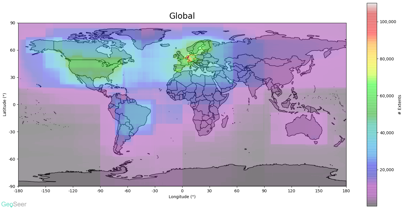
Starting with the global plot (above) it's obvious that the EU's INSPIRE directive has had a considerable effect, particularly in central Europe. The USA and Brazil also have considerable coverage.

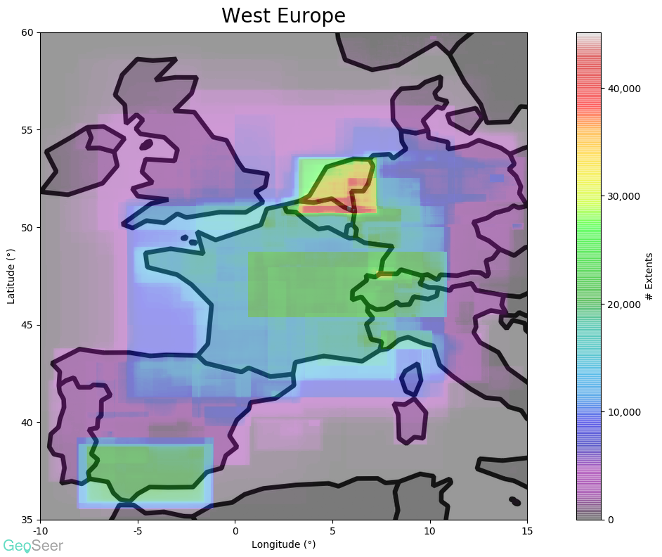
Looking closer at West Europe (below), it becomes apparent that the rectangular nature of the extents are causing lots of overlaps in the region of the Netherlands/Belgium/Germany tripoint (apparently called the Vaalserberg), hence the very high values there. That said, there's still a lot of datasets covering the region. West Europe

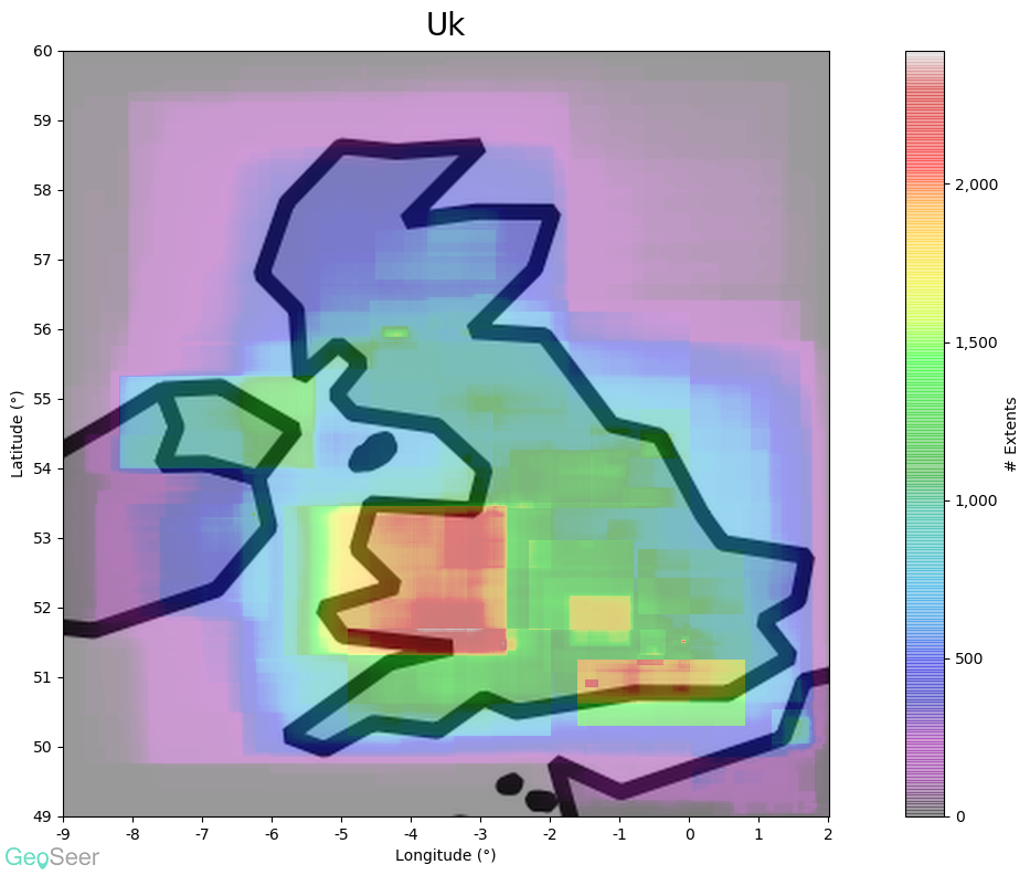
Zooming even closer to one specific country such as the UK (below), it's possible to see a lot of nuance that's swamped out at the smaller scales. It's now clear that Wales has excellent national coverage compared to England (which is mostly just the South East, not even London), and certainly Scotland (just Glasgow and Edinburgh). UK Extent plot


Bad data

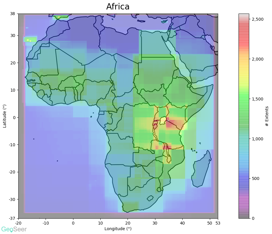
Do you notice anything odd about this plot of Africa (apart from it being green)? Africa plot with bad data

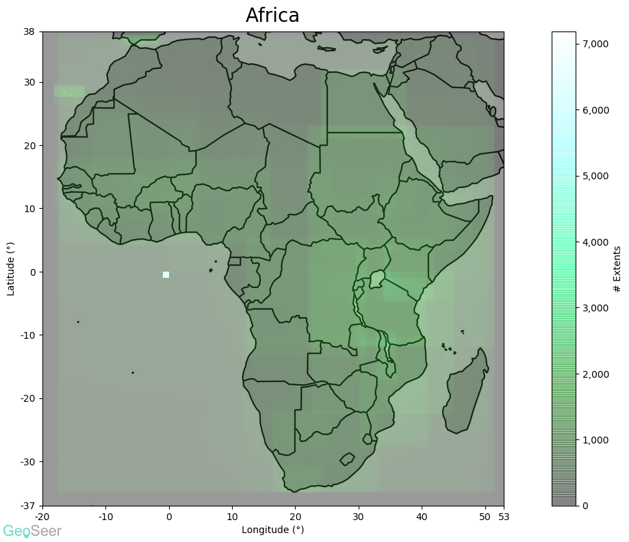
Yep, there's a very large number of datasets covering a tiny area off the west coast of Africa. Why? As you've probably guessed it's because 6,527 datasets are wrongly declaring their extent as being entirely around 0, 0 (lat/lon). This floods out Africa which unfortunately doesn't have many datasets in the first place. So we filter these bad datasets out of the plot extents to get the below. Now we can see that east Africa has a respectable number of datasets covering it, as do the Canary Islands. Africa plot with good data


Technical; How We Make Them

We use Python to create these plots by reading in all of the WGS84 (coordinate system) bounding boxes from the GeoSeer index, stacking them together with NumPy as a two dimensional array, and then plotting them out via MatPlotLib. NumPy does the magic of summing the extents together remarkably quickly so we can rebuild them every month with the updates.

Closing Remarks

There are other interesting insights that can be gleaned from these, take a look at the Datasets Extent Plots page for more. This is a good case study of the sort of cool stuff you can do with Python, and GeoSeer Datasets, for example if you have a research itch you need to scratch.

Because we like to share, the plots are available for use under the CC-BY 4.0 license, which means you can do anything you want with them but please link back to GeoSeer.

Finally, if there's any particular area you think would make an interesting plot, let us know and we'll take a look.


New Historical Statistics and Extent Plots

Posted on 2019-09-02

The GeoSeer stats page went live just shy of a year ago and we've been meaning to update it with more stats ever since. Today we've done just that, with a few new stats, and a lot of cool plots.

The first statistic is the most simple: The number of countries that are hosting OGC services. A country for our purposes is simply defined as having a unique ccTLD (the last part of a domain: .pl, .us, .br, .au, etc.). At the time of writing this blog post, it's 87 of the 244 defined ccTLD's. (Note this does include .eu for the European Union which most people wouldn't actually consider a country).

Historical Data

GeoSeer has been live for almost 18 months now, and we've been crawling the WWW for OGC services for even longer. This means we have a trove of historical data about services, and the new stats expose some of that. If you look at the stats page now, you'll see the General Stats section has been tweaked slightly.

As well as continuing to show stats about the current state of OGC services "Now", we've added an extra column for "Ever" which shows the total numbers that we've ever found since we started doing this. Then with a little maths we show the percentage of the things we've ever found that are still alive now.

The Ephemeral Nature of Public Data
Datasets

The single most glaring statistic from this historical data is that we've found a total of 4,949,124 datasets since we started crawling, but only 1,865,660 are live and active in our index right now. Or put another way, just 37.7% of the datasets hosted by OGC services that were publically available at some point in the past 18 months are still online!

Services

And while that's the most stand-out statistic, the others also show how transient the OGC services that host these datasets are. Over the course of the past ~18 months we've found 291,779 different services, yet only 71.83% of them were online and responding on our last crawl.

Hosts

The final statistic of note here is the number of hosts. These are the domain names themselves, and different subdomains are counted as different hosts (so www.example.com is different from ogc.example.com). Even these have experienced considerable churn over what is a relatively short period of time, with only 85.5% of hosts remaining online. We should point out that we ignore the scheme (that's the http:// or https://) and ignore the port when we consider if something is a "host", so if a host changes from insecure to secure (and quite a few do), it won't make a difference to this statistic.

Thoughts

All of this change makes it harder for users to rely on this data even if they can find it. Especially for things like scientific research which relies on repeatability, including the ability for other scientists to go back and take a second look at the original data; a difficult thing to do when the datasets/services/hosts have gone offline.

This also highlights the importance of keeping data portals current. Link rot is a real thing and data curators need to ensure they maintain their portals otherwise the portals are worse than useless (because they're wasting everyone's time with bad links).

Extent Plots

The other part of this statistics update is a collection of extent map plots that show what parts of the world have datasets. We're going to do a separate blog post about them in the future.


A Midyear Update

Posted on 2019-08-07

The GeoSeer index of OGC Services continues to grow, now standing tantalisingly close to 200,000 services: there are currently 197,911 from over four thousand four hundred different hosts. And of course this only includes active services; the index is kept in an "evergreen" state consisting only of services that actually worked when we last queried them. There are many more services that are intermittent but these aren't useful to you so don't feature in the index.

On adventures we go

As well as continuing to hone and expand the service, we've also been participating in some community events. In June we participated in the OGC's API Hackathon in London, part of the process for developing the next generation of OGC spatial standards. They're at an early phase - with API Features being the furthest along - and we participated with the aim of making sure that discoverability was kept in mind during their development. After all, there's no point developing cutting edge standards if no-one can find implementations.

Then we went to Italy to the European Commission's Joint Research Centre (JRC) - home of INSPIRE - to present and participate in a workshop about service discovery and search engines with regards to INSPIRE services. We met some of the people behind a few of the portals we harvest from, and exchanged thoughts on how services and data can be made more discoverable.

Statistics - SRS

We received a user enquiry as to which Spatial Reference System (SRS) was most common in OGC services, so we did a quick check and wanted to share the top results with everyone because who doesn't like stats. Note that there are lots of caveats that we won't go into here, we're sharing these as-is. It doesn't come as a surprise that EPSG:4326 aka WGS84, and Web Mercator are the most common.

SRS CodeNameNumber of datasetsNotes
EPSG:4326WGS84892,331Standard Latitude-Longitude
CRS:84WGS84514,924Longitude-Latitude swapped version of WGS84
EPSG:3857Web Mercator394,736De facto web mapping projection
EPSG:900913Web Mercator259,519Deprecated code for Web Mercator
EPSG:4258ETRS89166,684Europe
EPSG:25832ETRS89 / UTM zone 32N133,604Europe between 6°E and 12°E
EPSG:102100Web Mercator102,823ArcGIS Online version of EPSG:3857

The datasets define 1,318 different SRS'; above are just the ones with more than 100,000 datasets. We're always open to doing some stats analysis, just ask.

Licensing?

Finally, we've started investigating making the database available to third parties via licensing. If you're interested, let us know. Watch this space.


Blog content licensed as: CC-BY-SA 4.0